HEALTH & WELLNESS | GUMMY SUPPLEMENTS
PROXY
CONTRIBUTIONS
Branding & Packaging Design
Strategy & Positioning
Digital Design
PR Box
Brand Collateral & Merch
ROLE
Art Director
Design Lead
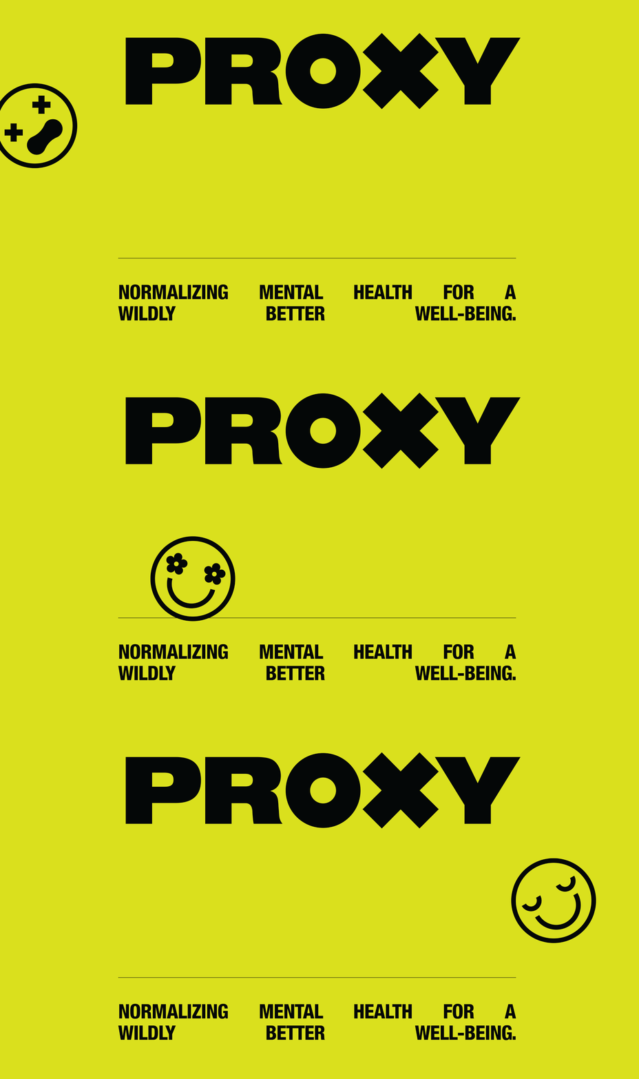
PROXY is normalizing mental health for a wildly better well-being.
My role consisted of helping build and launch the PROXY brand with the goal of helping connect with Gen Z consumers looking for mental wellness solutions.
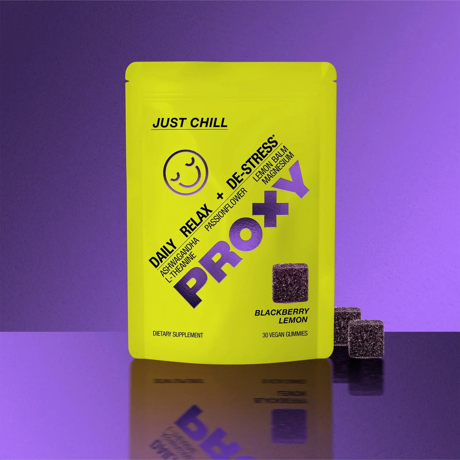
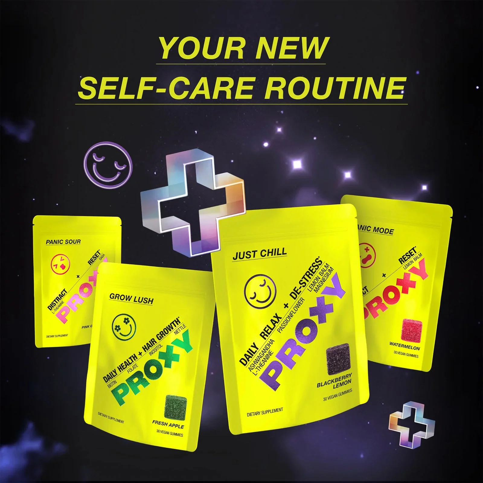
By creating a strong brand identity through strategic branding and packaging design, I helped bring the brand to life across digital platforms, including the website and social media. Additionally, I designed brand collateral like a PR box, merch stickers, and more.
BRAND STRATEGY & POSITIONING
The strategy was to reach Gen Z of all genders, looking for connection and resources to support them with mental wellness, by opening up the conversation about mental health with zero judgement.
PROXY normalizes mental health, making it more edgy, authentic and relatable.
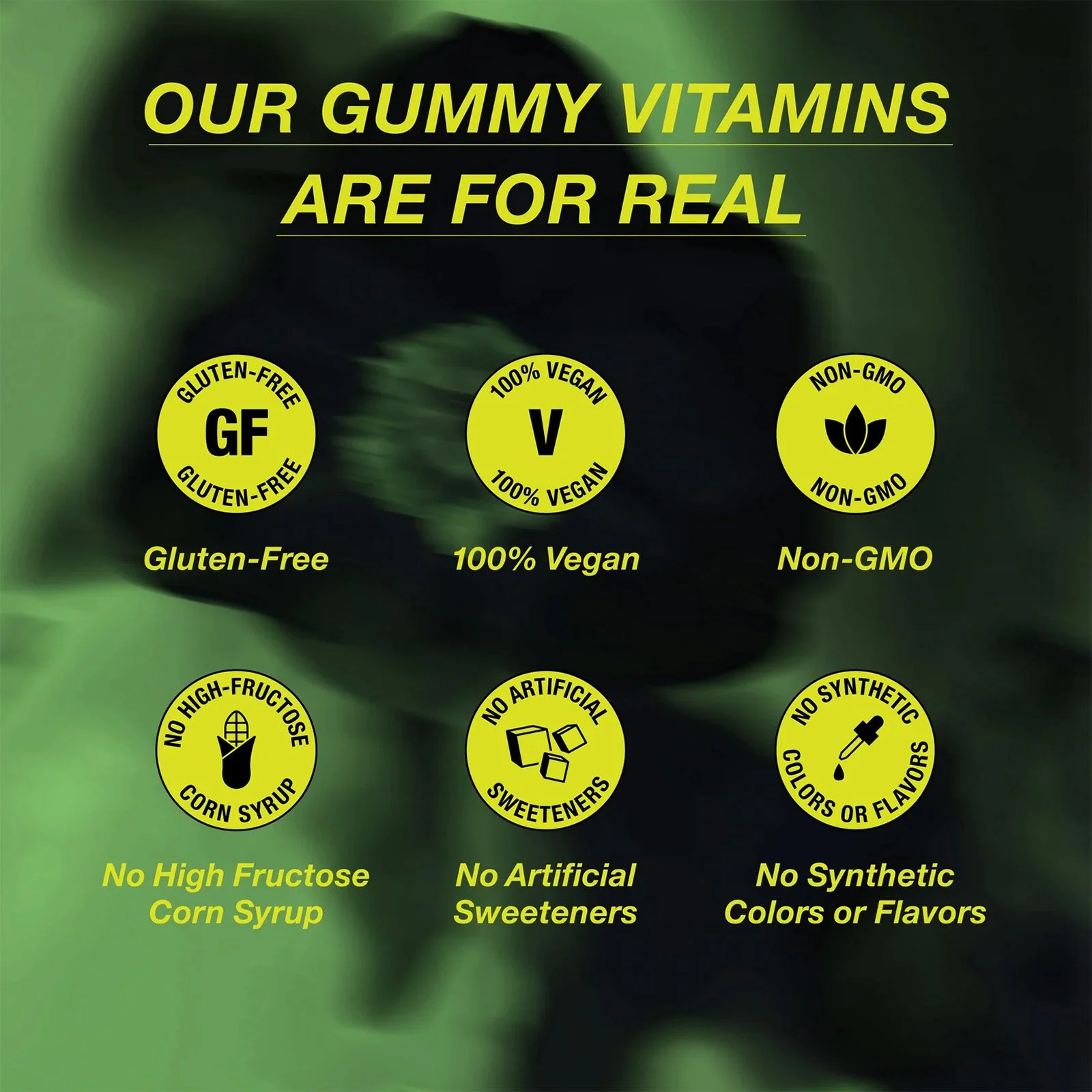
It’s about making a statement that inspires others and challenges traditional pharma, with the goal of being the most talked-about supplement in the market, because it works without synthetic chemicals.
DESIGN CONCEPT & DIRECTION
The art direction for PROXY was to represent, “Unapologetic Activism,” a wildly outspoken, yet relatable personality.
Leading with green, the official color of Mental Health Awareness, the European Pharmaceutical cross was chosen to convey PROXY’s commitment to mental health while challenging traditional (outdated) solutions for mental wellness.
Inspiration was drawn from caution tape, symbolizing PROXY’s unforgiving approach to challenging societal norms. A nod to XANAX - the #1 prescribed anxiety medication in the US - and its minimal aesthetic and type style was chosen to appeal to the casual, no-frills preference of Gen Z.
With 100% rich black and neons to bring an edginess to the supplement category, a balanced lift of friendliness using smileys was necessary to connect more directly with consumers and how they’re feeling.

