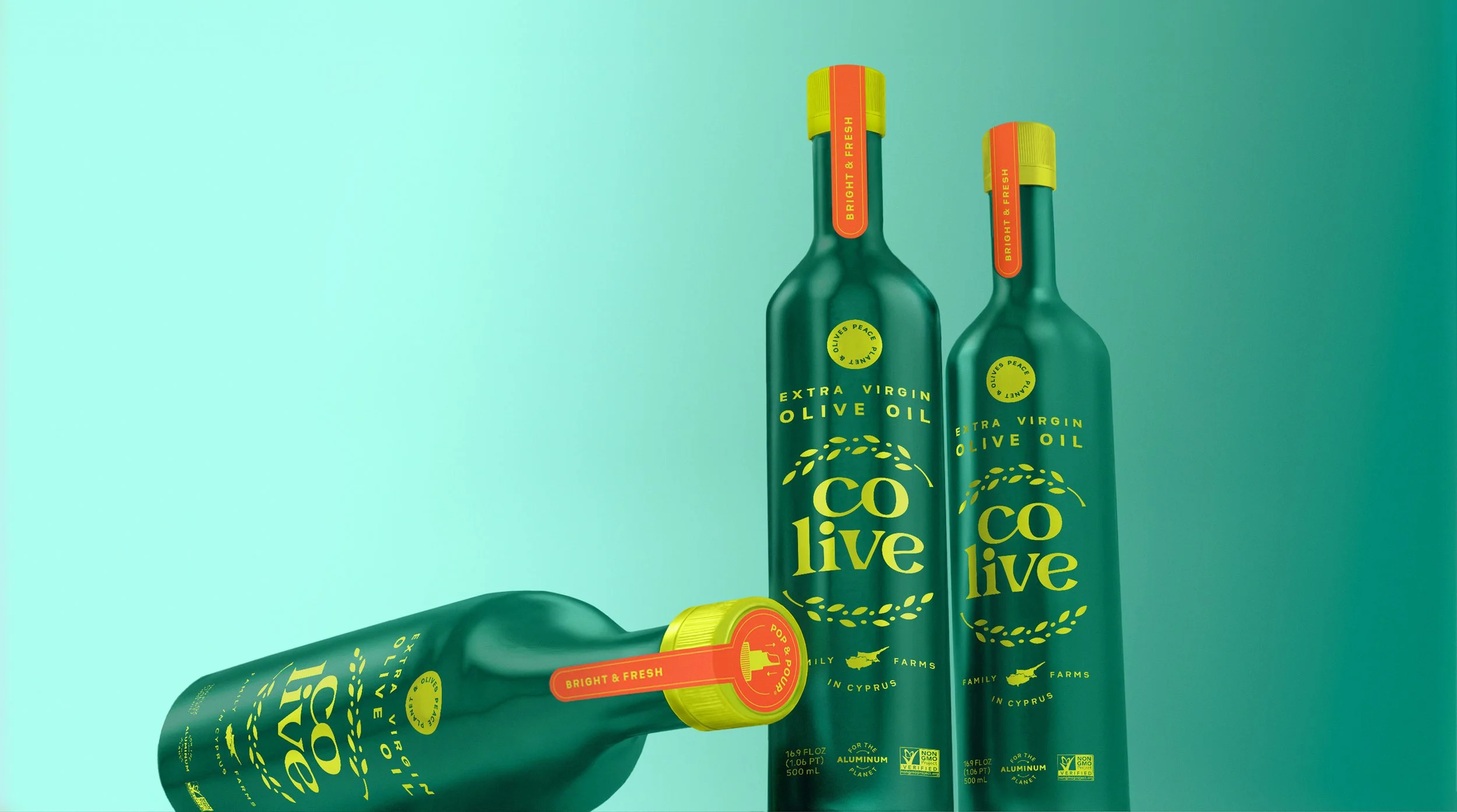
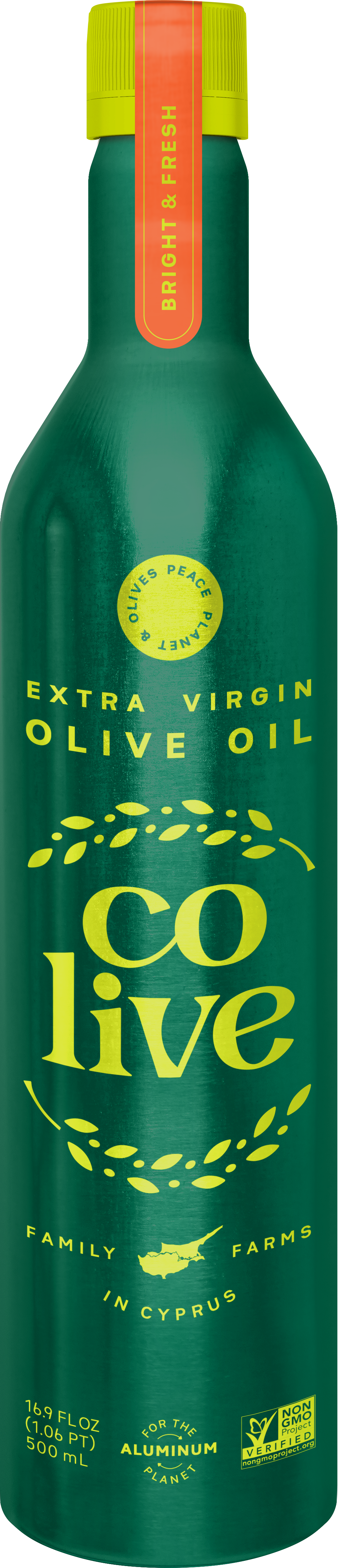
CONDIMENTS | EXTRA VIRGIN OLIVE OIL
Colive
CONTRIBUTIONS
Branding & Packaging Design
Strategy & Positioning
Iconography
Brand Guidelines
ROLE
Art Director
Design Director
Design Lead
Colive is an extra virgin olive oil brand from Cyprus on a mission to make the world a better place through sustainability and peace.
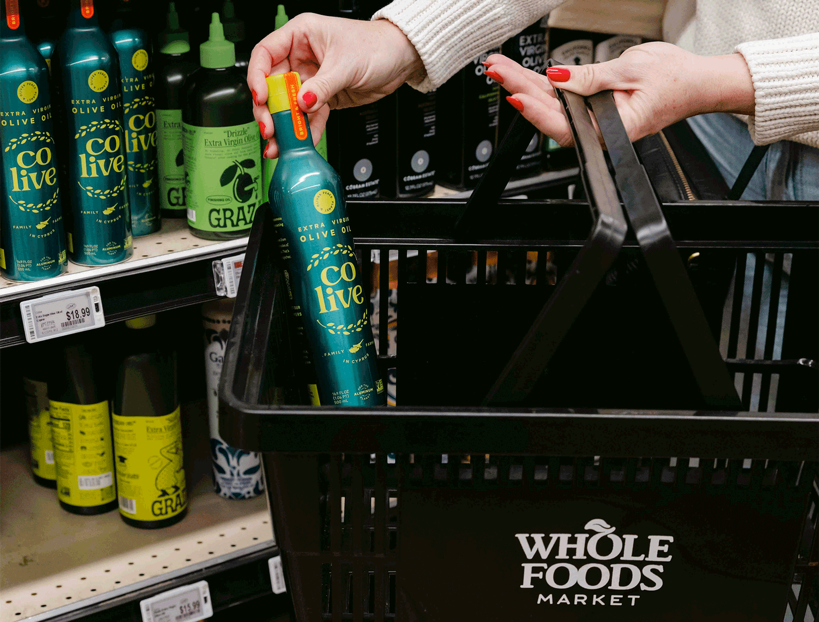
Colive needed help redesigning their brand identity and packaging design. The brand had already successfully made its way to the shelves of Whole Foods, but only selling ~1x unit per store per week.
The design challenge lied in differentiating Colive from competition, while staying true to its brands roots and core values. Recognizing opportunities for improvement in the brand’s original packaging design, such as which part of their honorable brand story to prioritize, proved to be key in strategizing for success.


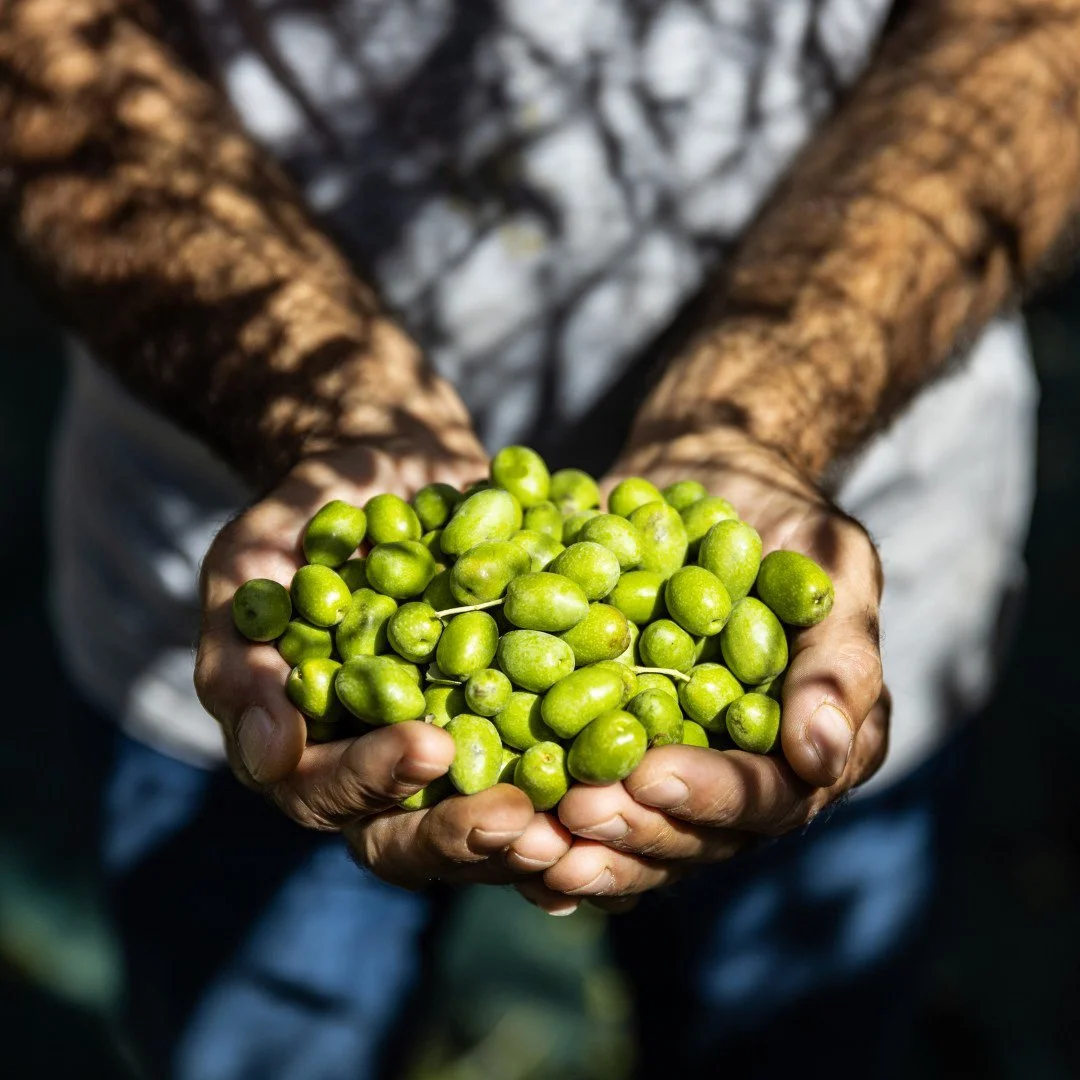
*Photo courtesy of Hart & Highland
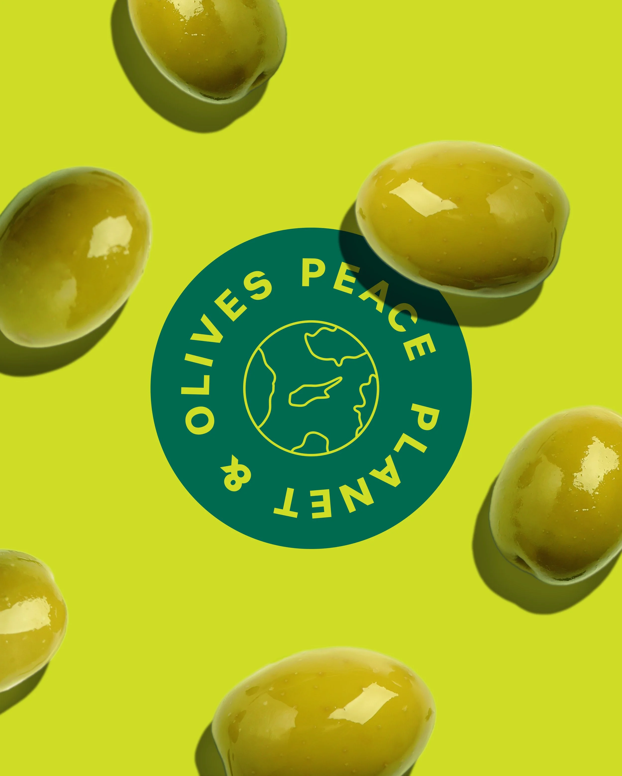

By emphasizing the Colive’s origins from Cyprus, the brand would undoubtedly stand out amongst competitors. This inspired deep research into the historic charm of this often underestimated, yet beautiful and bountiful island in the Mediterranean, known for their rare Cypriot olive cultivar and beyond.
For the consumer who seeks authenticity and connection in their brand choices, the goal for brand strategy was to align these consumer values to forge a deep emotional connection and share passion for cultural diversity.
BRAND STRATEGY + POSITIONING
Colive's brand strategy was centered around establishing an identity that celebrates the culture, history and abundance of Cyprus. Considering Colive is the first Cypriot olive oil brand at Whole Foods, it was the perfect opportunity to offer a distinct product offering within the market landscape.
*Video courtesy of Hart & Highland
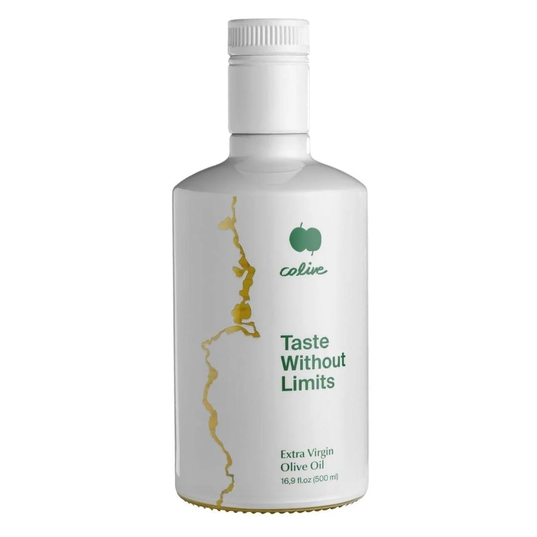
BEFORE
AFTER


DESIGN CONCEPT & DIRECTION
The art direction for Colive's brand identity and packaging aimed to authentically represent the rich and artisanal old world heritage of Cyprus, while striking a delicate balance between feeling inviting, modern and new age.
Studying competition as well as other emerging EVOO brands, proved helpful in understanding category cues and opportunities such as using captivating, high-contrast colors, communicating hierarchically and encouraging daily/frequent use with an approachable style.
The design direction also consisted of a deep study of culturally significant symbols representative of Cyprus’ culture. The representation of more approachable motifs like the national flag and geographical map, provided a warm introduction to the country and brand.
New customers would be welcomed with a strikingly bold teal-green and red-orange deriving from the flag and Cyprus’ historic architecture, and early harvest unripe green olives - the key ingredient of Colive’s EVOO.


Unselected Design Platforms
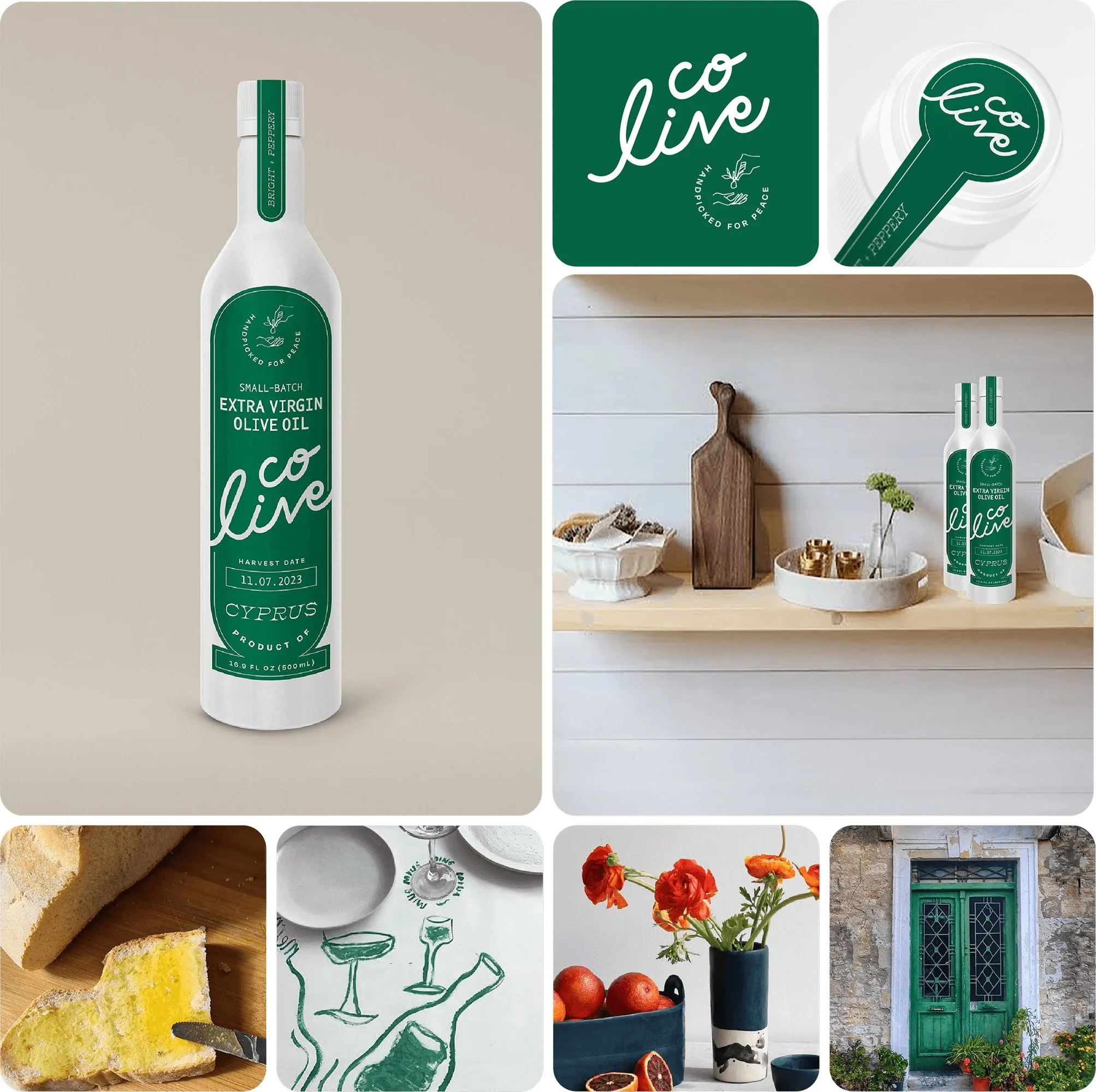
CARING + CRAFTED
Small-Batch / Transparency
The art direction for this design concept was to embody the Colive’s core values of authenticity, craftsmanship and transparency. Motivated by the small-batch quality and transparent harvest date stamp, this design conveys the personalized care in each hand-picked olive.
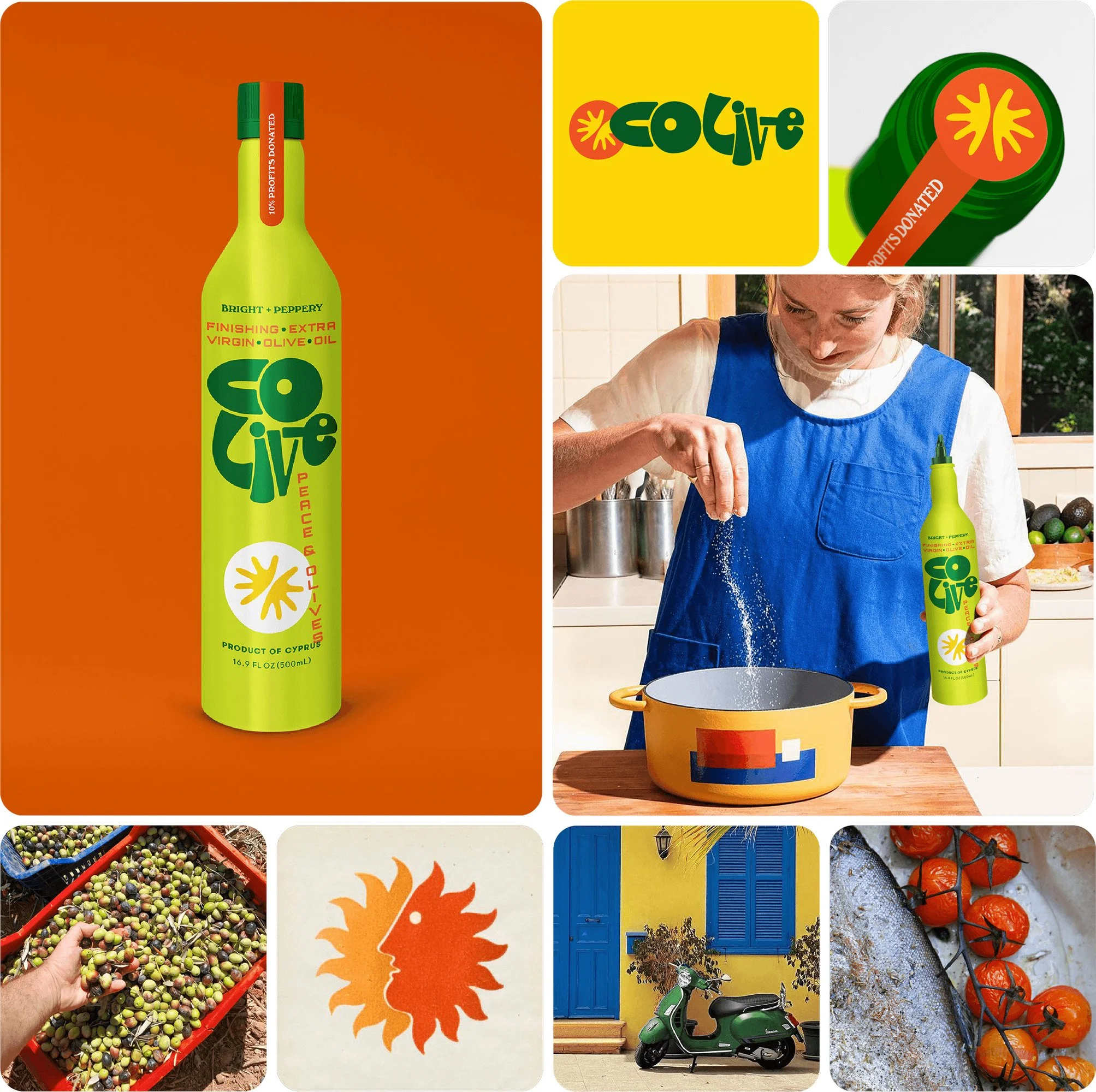
HOPEFUL + RADIANT
Peace Mission / Giving Back
This design concept draws inspiration from Colive's social mission and promise to give back, with the goal of evoking peace, optimism and hope for change. Influenced by 1960s aesthetics and European signage, the retro, hand-drawn typography embodies harmony, cheerfulness and a bright personality.

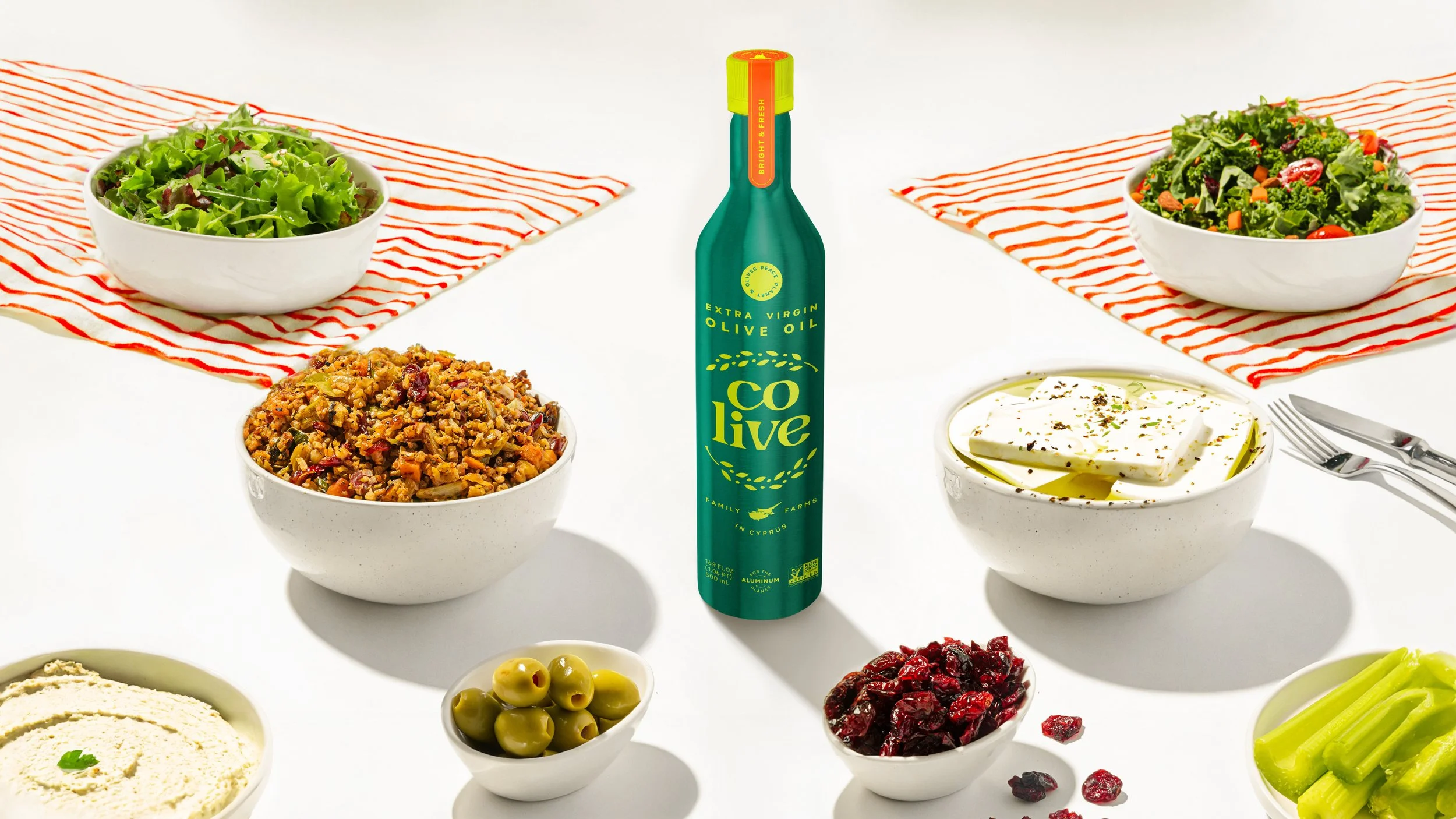
OUTSPOKEN + EARTHY
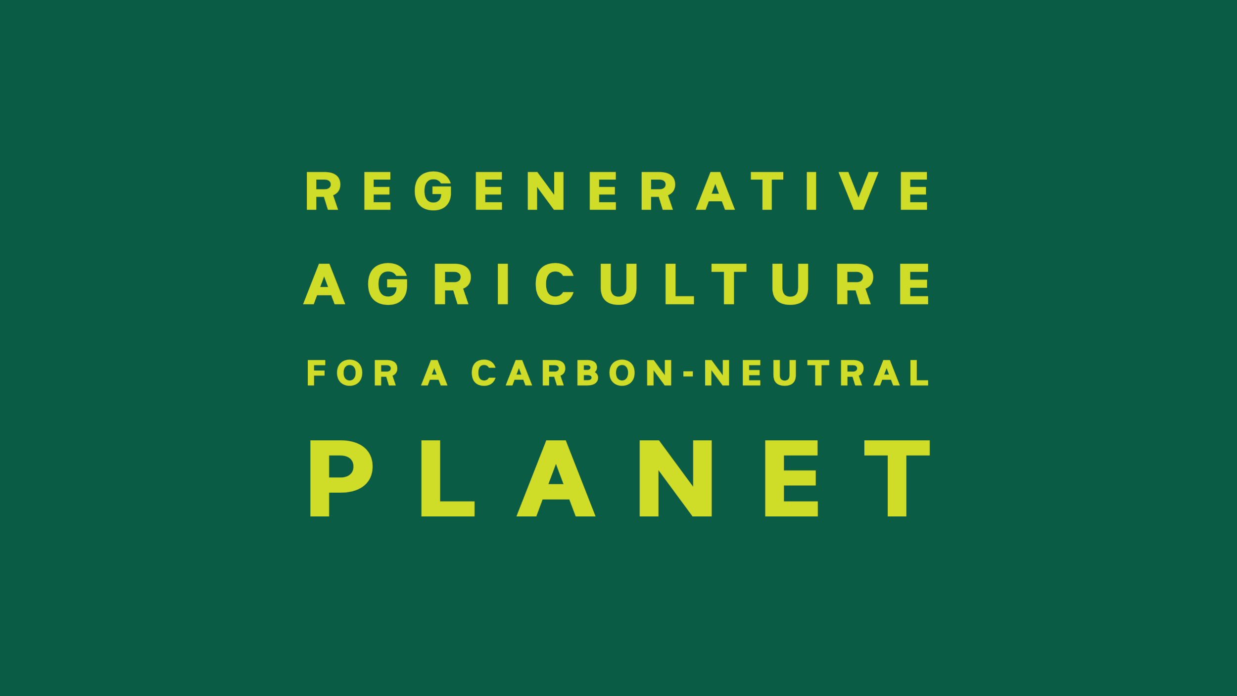
Regenerative Organic / Sustainable Aluminum
Crafted to express a loud message on sustainability, this concept focused on the regenerative organic certification and sustainable packaging. Aiming to spark conservation, the minimalist, clean and modern graphic style, plus the energizing Mediterranean blue, olive green and metallic tones come together to tell this planet-forward story.
PROJECT LEARNINGS
This project was one of the more strategically comprehensive packaging projects I’ve worked on. Firstly, the brand already existed. This meant helping the founders understand what wasn’t working about their existing brand, and that in order to achieve their goals they needed to let go of it almost entirely.
Secondly, it proved to be a challenge in exploring art direction for a brand that has many competitive advantages. Narrowing to prioritize one area of focus allowed for more streamlined storytelling and direct consumer connection.
Having less guardrails to begin with can ironically be more limiting, as opposed to working with constraints. The decision to strategically explore across design against each positioning opened the door for more curiosity, creativity and expansion throughout the design journey.
I was fortunate to work with a team of talented designers that helped execute on 4 unique design platforms.